Everything that has changed in QM Screener, newest first.
A guide to screening for momentum stocks
How to screen for momentum stocks is a new guide: the five measurements a momentum screen is built from, the thresholds this one uses (RS above 93, ADR above 2.50%, 50-day dollar volume above $20M), what the setup tags mean, and an end-of-day routine. Each step is pictured with the product.
The home page now shows today's top setups the moment it loads, and the FAQ answers what a momentum screener is and whether there is a free one.
The Value tab is a real list now
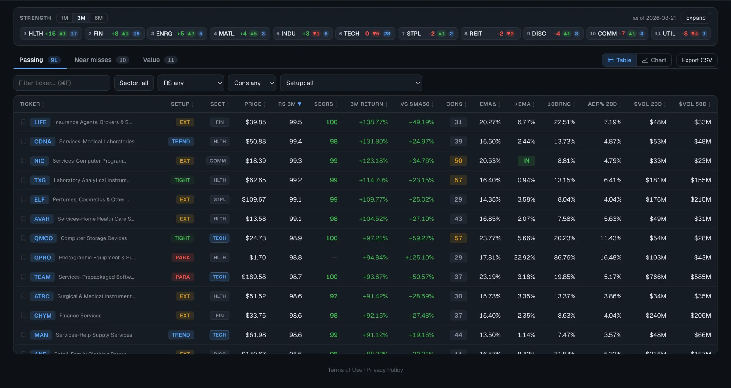
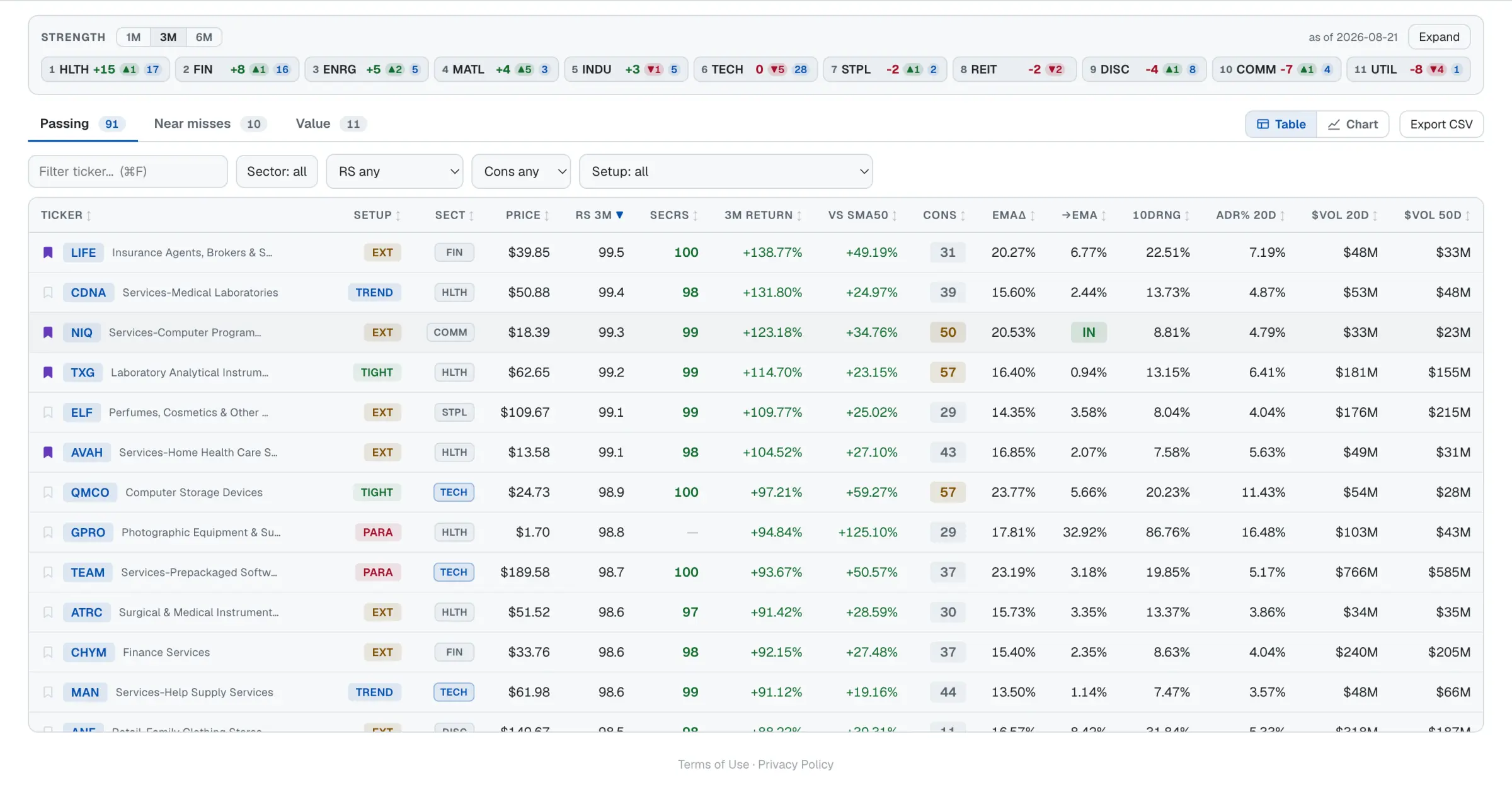
The Value tab was a row of bare tickers; now it's a sortable table like Passing and Near misses: price, distance below the 50-day, RS 3M, 3M return, ADR and dollar volume, sorted by distance.
Beside a docked chart it's the same sidebar the other tabs use: ↑/↓ walk it and the bookmark works on every row. On a phone it's the same tile strip. AI assistants asking via MCP get full rows, each with 3-month return next to SPY's.
Snap to the candle, and measure a move
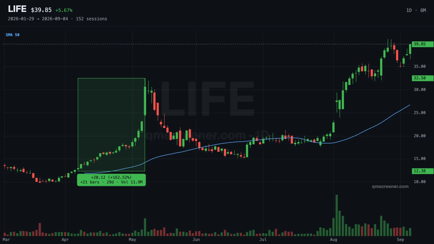
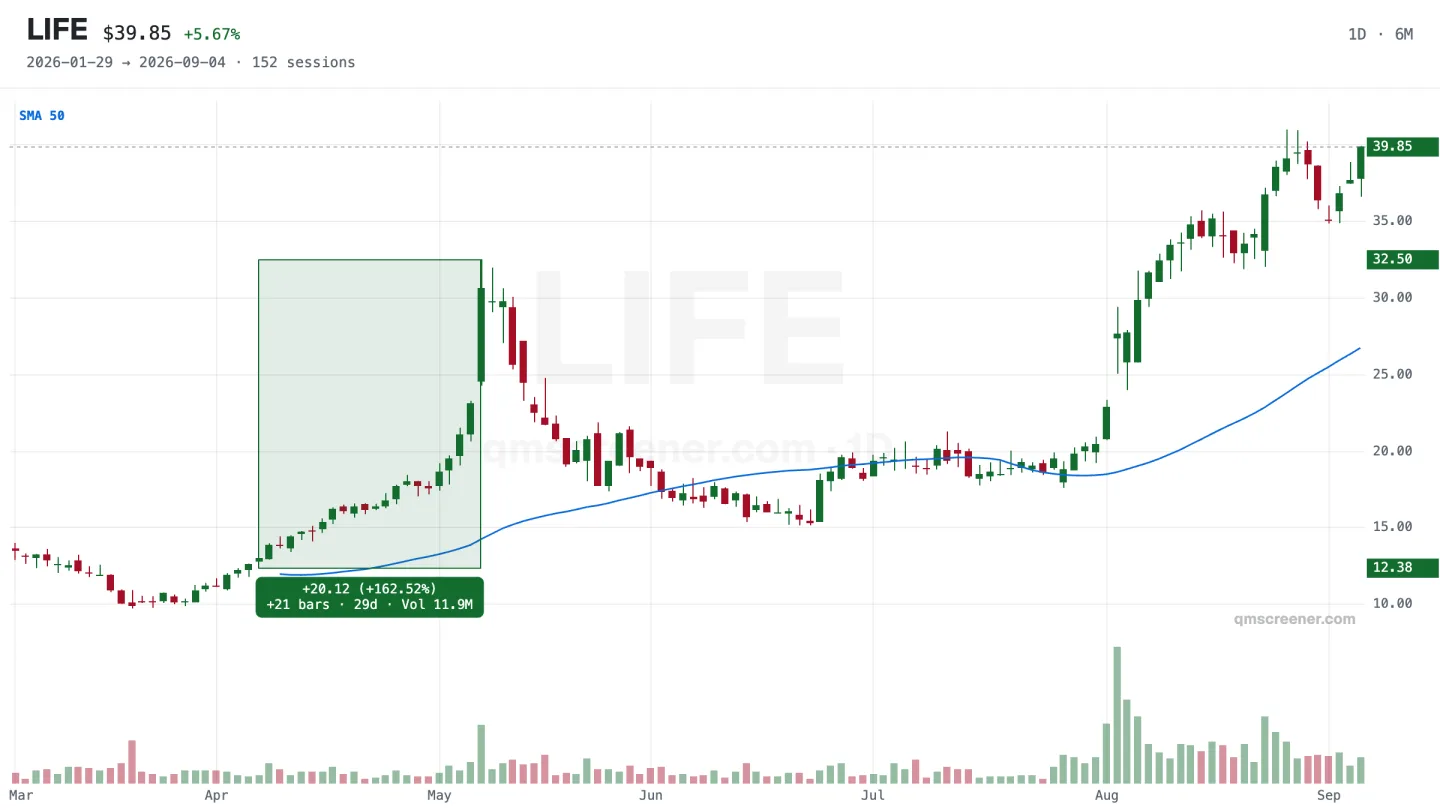
Two new buttons in the chart's drawing palette. Magnet snaps every anchor to the nearest open, high, low or close on the bar under your cursor, so a level lands on the candle instead of near it — hold the command key (Ctrl on Windows) to flip it for one point.
Shift+drag the plot to measure: the label reads price change and percent, bars and calendar days crossed, and the volume inside. The next click clears it.
Connect an AI assistant to the screener
Open the ⋯ menu and pick Connect AI assistant…. The dialog holds the address to paste into Claude, or into anything else that speaks MCP.
Three of the five tools are open to every signed-in account: today's top setups, the list of screens, and sector strength. A subscription adds full result sets and price history. If you signed up with Google, you can now approve the connection with Google too.
A clearer Export menu
The Export menu is now a Filtered / All switch above three groups — Share, TradingView watchlist, CSV — with every row carrying an icon and the number of names it will write. The switch appears only when your filters actually cut the list.
On a phone it opens as a sheet with full-width rows. Rows that duplicated each other, or that no screen could fill, are gone.
A heading on the chart list, and a bookmark instead of a star
Chart view's ranked column has a heading now — ticker on the left, the screen's lead number on the right — and it stays put as you scroll. An emptied list keeps that heading and says what emptied it: nothing bookmarked yet, nothing bookmarked on this screen, or no matching rows.
The ★ is a bookmark: outline when off, filled when on. A star reads as a rating, and nothing here asks you to rate anything.
Free accounts see the real dashboard
A free account used to land on a separate locked page: blurred rows, no chart, nothing to sort. It now gets the actual dashboard, with five names on every screen — charts, sorting, filters, the watchlist and the sector tape all working on those five.
The banner says how many names passed today, so you know what the rest of the list holds. Subscribing widens the same page rather than moving you to a different one.
The daily email opens with three charts
The daily email was a list of tables. It now leads with the three names that cleared the most screens, each drawn as three months of daily candles with the 10/20/50 EMA band and volume — the band the setup tags are read from.
Leading by how many screens a name cleared, rather than by relative strength, keeps illiquid microcaps out of the top. Every number a chart shows is written beside it in text, since mail clients block images.
Which session you are looking at, in the market's clock
The header read “as of today 23:33” — a clock from another time zone, on a page where every other number is a US session. It names the session now: “as of today's close”, with the exact run time in market hours on hover. The share image, share text and CSV carry the same stamp.
Also: filter dropdowns are scaled to the list they filter, so no option selects everything — and the table header stays put as you scroll.
The chart, usable on a phone
On a phone the chart could be looked at and not touched, in a third of the screen. It pans and zooms under your fingers now, the plot has roughly twice the area, and the list of names is a strip above it rather than a column below.
The ⋯ menu, Export and the sector filter open on a phone again too. They had been opening inside a sideways-scrolling strip, which painted them away to nothing.
Ray, note and anchored VWAP
Three drawing tools. A ray marks a level from the bar it was set on, so the chart still says when it became one. A note pins a few words to a single candle and travels with it through pans, zooms and the weekly view. Anchored VWAP runs a volume-weighted average forward from a bar you pick — an earnings gap, a pivot low, the day a base began.
They are remembered per ticker and appear in the shared image.
Company names beside tickers
The chart header read MRVL and nothing else. It reads “MRVL · Marvell Technology, Inc.” now, with the last price and the span of history on screen.
Every result row carries its company name too, and the symbol search matches on it — typing MARRIOTT offers MAR and VAC. A name listed in the last day shows a bare ticker until the next refresh picks it up.